Print at Actual size / 100% with browser headers and footers turned off. Only whole systems that fit are drawn; reduce the system count or spacing if you need more room.
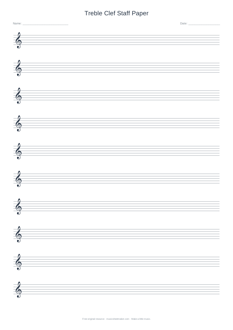
Choose larger treble staves for clear, comfortable handwriting
Print wider-spaced treble staves when a learner or writing task needs more room. This template starts with Large staff spacing and six systems rather than squeezing many small staves onto the page. Try a physical test copy, then adjust the layout to the person who will use it.
- Printed layout
- Single five-line treble staves
- Starting settings
- 6 systems, Large spacing, A4
- Available spacing
- Compact, Standard and Large
- Clef choice
- Fixed treble here; use the generator for bass
Start in three steps
- 01
Start with the learner
Choose a short task and a writing tool before deciding how many systems to print.
- 02
Keep the intended size
Select A4 or Letter and export the current PDF with Large spacing selected.
- 03
Check at reading distance
Print at Actual size and ask the learner to place and identify several noteheads.
Give each musical mark a little more room
Large staff paper increases the space between the five lines. A notehead can sit clearly on one line or within one space without appearing to cover both. That can help early handwriting practice, a demonstration with a thick pencil or an exercise where a teacher needs to add a correction beside the learner’s work.
Larger spacing is a layout choice, not a guarantee that a page will meet every visual or motor-access need. The useful size depends on the reader, their viewing distance, the instrument setup and the writing tool. Start with a small task and ask the person using the page whether the lines, symbols and surrounding space are actually comfortable for them.
Begin with placement before adding complexity
A first activity can use only three notes around a landmark. In treble clef, locate G4 on the second line from the bottom. Write F4 in the space just below it and A4 in the space just above it. Ask the learner to point to each position, name it, and then draw another example with enough room for a separate notehead.
Keep the duration constant while learning pitch placement. Once the positions are comfortable, add quarter-note stems or compare a quarter note with a half note on the same pitch. This separates the shape of the note from the question of where it belongs. A successful short line is a better starting point than a full page that mixes unfamiliar pitches, accidentals and rhythms.
| Task | Expected position | What to notice |
|---|---|---|
| Write G4 | Second line from bottom | Line passes through the notehead |
| Write A4 | Second space from bottom | Notehead sits between two lines |
| Write B4 | Third line from bottom | A step above A, not a jump |
| Read back all three | G, A, B | Pitch rises line?space?line |
Use the result to choose spacing, rather than promising a universal accessible size. Wider staves help only if the printed task is actually easier for this learner.
Use space to make feedback visible
Leave one system for a teacher’s model and one for the learner’s attempt. If a note is misplaced, draw the intended location next to it rather than covering the original with a heavy correction. The extra room makes the difference visible. Ask what changed: did the note move from a line to a space, or did only its duration change?
For a rhythm activity, use a repeated pitch and write one bar at a time. Mark the beats below so the learner can tap and count before playing. For a composition task, limit the vocabulary to a few known notes and two durations. The page should remove a physical obstacle to working, while the lesson itself remains focused on one musical idea.
Balance staff size with space around the staff
The large setting is the starting point for this resource, but the controls also let you compare compact and standard spacing. Choose a system count that leaves room above and below for stems, ledger lines, lyrics you add by hand or a teacher’s notes. Making staff lines larger without allowing vertical breathing room can move the crowding problem somewhere else.
Only complete systems that fit are drawn. If a high requested count does not appear, reduce the count instead of shrinking the final printout. Use the title to identify the activity. If an unmarked staff or bass clef would suit the lesson better, use the custom blank-paper generator rather than assuming this treble-clef template changes its clef through the spacing control.
Check the physical page, not only the screen
A large page preview on a monitor does not tell you the final printed size. Choose A4 or US Letter to match the loaded paper, then use Actual size or 100% in the print dialog when possible. Turn browser headers and footers off. Check the preview for clipping before printing, especially if the printer has a relatively large non-printable margin.
Make one test copy and place it where it will be used: on a desk, piano stand or classroom table. Check whether the learner can see the lines without leaning awkwardly and whether their pencil marks remain distinct. If the printer automatically reduces the page, adjust its settings or select a different layout and test again. Save the successful PDF so the same dimensions can be repeated.
Keep the musical instructions just as clear
A larger staff does not correct unclear notation. Write the clef and opening signatures deliberately, use consistent notehead sizes and keep bar totals accurate. Leave room before accidentals and avoid drawing ledger lines across the entire system. Annotations should help the reader find the musical information, not compete with it in several different colours and sizes.
This resource is blank paper, so it does not assess writing, recognise notes or provide a specialist accessibility adaptation. The original template is free for personal practice, lessons and classroom handouts under the site’s terms. For an interactive activity, try note-reading practice; for a digital melody you can hear, use the main editor. Keep any musical material you reproduce within the permissions you hold.
Large Print Staff Paper: frequently asked questions
Is this only for young beginners?
No. Larger spacing can be useful whenever the activity needs more physical room, including demonstrations, detailed annotations or work with a thick writing tool. The best layout depends on the person and task. Print a test and ask the user whether it improves their actual experience.
Why should I avoid Fit to page?
Automatic fitting can shrink the staff and undo the larger size you selected. Actual size or 100% preserves the intended dimensions when your printer supports the margins. If fitting is needed to prevent clipping, compare a test copy and choose the result that remains readable.
Can I make a large bass-clef page?
Yes, through the blank staff paper generator. Choose bass clef and large spacing there, then inspect the preview before downloading. This particular printable starts as a treble-clef layout, so changing its title does not change the musical reference established by its clef.